Frontend accessibility – Doing it the right way
Having been a front end developer for 7+ years, it had never occurred to me that my work needs to be accessible. Until recently that is.
Yes, but we do supply images with alt tags and use header, footer, main, aside, nav and section tags. That’s it. Most of us stop there. Some of us still use divs with a class name for these particular Layout Elements. Why? Because we do not know.
It’s not anybody’s fault that we do this. Except for a handful of people, most of us in this field have been pushed into this hole to earn a living. And the majority of them stay in that hole doing the same thing over and over, till the end, thinking what the hell am I even doing.
Until there is a need to that is.
Maybe that need will be in the form of enlightenment, which by the way rarely happens. Or maybe from a shift in guidelines of your team to incorporate the right accessibility norms of the industry as a mandatory requirement.
The latter is probably the case that both you and I are here.
Enough chitchat. Let’s get straight to the point now.
Not intended for the advanced front-end techies. I am not covering accessibility in detail. I just want to make a simple guideline that we can all follow in all of our projects. Sort of a checklist of things to keep an eye out for.
If you do find any mistakes, please feel free to point them out. I will correct them asap.
Following is a list of things that we need to keep an eye out for while developing any front end.
- HTML Semantics — use HTML sectioning elements properly
- Headings — use to show document structure and not when the font is big in design
- Keyboard Navigation using “tabindex” and ARIA — make sure tab-able and remove redundant tab links.
- Accessible Icon Buttons — at the very least use <button> tags with proper label
- Focus Indicators — do not disable default focus styles, if you do give an alternative
- Provide visual labels whenever possible
- Descriptive Infographics — provide a fallback text description for the screen readers
1. HTML Semantics
There is something called ARIA landmarks. It’s simply dividing the webpage into different landmarks. This makes it easier for screen readers to navigate inside the webpage.
Now, this is something that we do not need to think actively to achieve since we are probably doing this without even knowing. That is “HTML sectioning elements by default define ARIA landmarks.”
Meaning use HTML sectioning elements correctly. Use <header> <main> <nav> <footer> <article> <nav> etc where meant to be. Don’t use <div class=”header”>.
Check out ARIA practices to learn now more in-depth.
2. Headings
Another way screen readers navigate the web page is by using headings.
Use headings as a means to show the document structure. Do not use headings if the text is just big or bold in the design.
Consider an example where there is no h1 inside a page. When a screen reader looks at such a page. The user can not get an idea of the title of that page which is normally expressed using the <h1> tag.
In such a case to improve accessibility you can do 2 things.
- Ask the designer to make some necessary changes. Which probably won’t work since the design has already been signed off by the client.
- Add a <h1> tag to the structure and hide it visually.
Now when we have to hide something from the web page we have a few options.
- display: none;
- visibility: hidden;
- opacity: 0;
- clip-path: inset(100%)
Options 1 & 2 are not usable since they remove the item completely from the DOM and are unavailable to screen readers as well. The hidden attribute is also a no go. Since it’s equivalent to a display: none;
Use the below as a utility class to hide your element
.sr-only {
    clip: rect(0 0 0 0);
    clip-path: inset(100%);
    height: 1px;
    overflow: hidden;
    position: absolute;
    white-space: nowrap;
    width: 1px;
}
3. Keyboard Navigation using “tabindex” and ARIA
We need to understand that not all users use the mouse to navigate our webpage. Some use only keyboards to navigate. And some screen readers.
For such a user to reach from one part of the webpage to another, the journey might not be as straightforward as for someone who just scrolls using a mouse.
Let’s consider the following example.
Imagine we have a blog. And on our article listing page, an article looks like the one below.
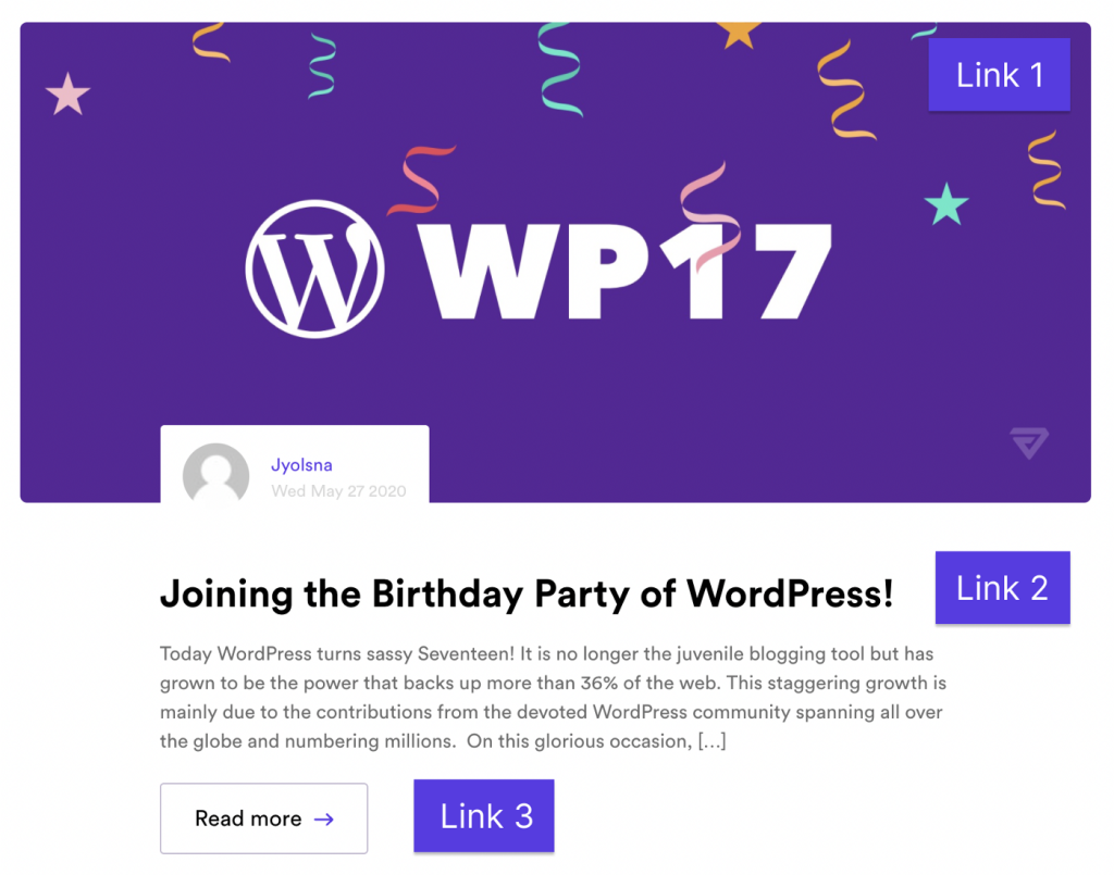
It has a thumbnail, a title, a description and a “read more” button. This is the common template for almost all blog articles. So how do we go about linking it to the detail page?
We make the thumbnail a link(Link 1), the next is the title(Link 2) and then the read more button(Link 3)
Now we have 3 links all pointing to the same page.
When using a screen reader or if we tab through the page using a Keyboard, we have to tab through a single article 3 times to jump to the next article.
This has to be avoided and can be. It’s fairly simple. For the links that are redundant add the following attributes.
- tabindex = “-1” (it prevents the link from being tabbed — for Keyboard users)
- aria-hidden = “true” (you don’t need this link to be exposed to screen readers since we already have another link with the same functionality — for screen readers)
4. Accessible Icon Buttons
First and foremost is to use the <button> element when there is a button in the design. Do not use other elements like a <div> and style it to look like a button. I know we have been doing it this way for a long time. But it’s time to change.
The reason is as stated in the HTML Semantics section, the native elements have a lot of built-in ARIA features.
Although a button made using a <div> and <button> visually seems the same to the majority of the users like us, it looks very different to a blind user using a screen reader. Screen readers might even miss recognizing it as a button.
Now there are some caveats here as well.
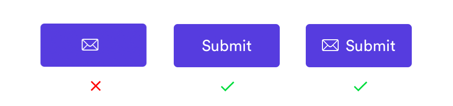
What about buttons without any text. Just images. Now there will be situations like this. At times follow any of the three steps below.
- Use a hidden <span> to specify the button label
- Use aria-label on the <button>
- Use aria-labelledby on the <button>
If you are interested check out this blog post to know more about the above steps in detail
5. Focus Indicators
Have you ever used the following code?
:focus {
    outline: none;
}
That outline we see when we press the tab key on our web page is the focus indicator. And we mostly always disable it using the above code. At least I used to do it before.
This is a really bad idea. Focus indicators tell the users who navigate the page using the keyboard where they are currently interacting. If we remove the focus style, then we are leaving those users in the dark. Hiding a focus indicator is like hiding the mouse cursor.
So if you remove the default focus style, be sure to add your custom focus styles.
When styling the focus indicator, we need to consider the following.
- the contrasting area
- contrast with adjacent colour
- Never obstruct the focused element
In the following example, black specifies the focus indicator enabled state(how it looks when it’s tabbed using a keyboard).
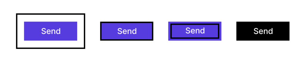
contrasting area — where the actual colour change occurs
adjacent colour — the colour adjacent to the focus indicator
There should be a minimum contrast ratio of 3:1 between the colours of focused and unfocused states. Also between the focus indicator and the adjacent colour.
Meaning if you give a focus indicator style of the black border of 2px to a green button on a page with a background colour white. Then there should be a minimum contrast ratio of 3:1 between black and green also black and white.
If you are overriding the default focus styles, then use the following code.
:focus {
    outline: none;
}button:focus {
    /* some exciting button focus styles */
}button:focus:not(:focus-visible) {
    /* undo all the above focused button styles if the button has focus but the browser wouldn't normally show default focus styles */
}button:focus-visible {
    /* some even *more* exciting button focus styles */
}
If you are interested check out this blog post to learn in detail
6. Provide visual labels whenever possible
This comes in handy for people browsing the web using voice commands. It’s is a bit tricky. I’ll explain why. Firstly, think about how voice recognition software work?
Let’s take Apple’s Siri for example. We say a keyword, “Hey Siri” followed by the command that we want to execute.
An example would be “Hey Siri, What’s the time now?”
Now imagine navigating a webpage using Siri.
If there is a button called Send. We could say “Hey Siri, click Send button”. That’s pretty straight forward right?
Now imagine if the button only had an icon instead of the label “send”. Now how will you tell Siri to click that button?
So, provide visual labels whenever possible. If it’s impossible then at least make it tab-able.
7. Descriptive Infographics
When using SVG for an infographic like a chart or some other type of data representation they usually don’t provide any information for accessible users. For the accessible users to make use of such an implementation the best way would be to provide them with a description of the infographic as text so that a screen reader can pick that up.
The following example would be a good way to implement such an SVG.
<object
    role="img"
    aria-label="Average something of something"
    aria-describedby="something_desc"
    data="some.svg"
    type="image/svg+xml"
>
 <!-- fallback -->
 <p id="something_desc">90% increase in number of sales in the year 2022 with proper SEO tactics implemented as to no SEO done for the previous year.</p>
</object>
An overall checklist to turn to
- Have I used all the HTML sectioning elements correctly and not just divs?
- Are the Headings used for proper structuring and not to emphasize size?
- Have I excluded unwanted links using tabindex -1
- Are all the buttons accessible? Do they have a proper name or label? If not have you provided ARIA labels or alternatives?
- Have you changed the style of the focus indicator? If so are they compliant with the norms?
- Buttons, form elements like checkboxes and radio should be accessible
- provide visual labels wherever possible
- Infographics should have a fallback with a verbal explanation. If using SVG use <object> with fallback description
- Offscreen links should be disabled from tabbing using tabindex = -1 else user will be stuck thinking nothing is happening
Accessibility is an ocean and I have only scratched the surface. Hopefully, with this, I was able to shine some light on a potentially dark zone for most of us out there.
Everything that I have explained here is based on the blog and talks of Sara Soueidan. Check out her blog to learn more. She has a lot of cool topics and does a good job of explaining everything in-depth.
